| Author |
Message |
Theldorrin
Joined: 04 Jan 2007
Posts: 19724
(Mon Feb 19, 2007 12:21 pm)
Reply

|
 Typesetting Typesetting |
|
|
| This thread is about typesetting, and typography in general. |
|
Theldorrin
Joined: 04 Jan 2007
Posts: 19724
(Mon Feb 19, 2007 12:22 pm)
Reply

|
 Re: Typesetting Re: Typesetting |
|
|
| Chris, you mentioned that you regret using Times New Roman for one of your books. What font would you have preferred? Or is it just a question of using a postscript font? |
|
Username
Swimmin' in a Magnum
Joined: 20 Jan 2007
Posts: 3106
(Mon Feb 19, 2007 8:08 pm)
Reply
|
 Re: Typesetting Re: Typesetting |
|
|
| I honestly didn't think it looked all that bad, but I guess I don't have a trained eye for that sort of thing. |
|
Theldorrin
Joined: 04 Jan 2007
Posts: 19724
(Mon Feb 19, 2007 8:10 pm)
Reply

|
 Re: Typesetting Re: Typesetting |
|
|
| I can't see it because I'm not american. Someone post a page. |
|
Username
Swimmin' in a Magnum
Joined: 20 Jan 2007
Posts: 3106
(Mon Feb 19, 2007 8:31 pm)
Reply
|
 Re: Typesetting Re: Typesetting |
|
|
 |
|
Theldorrin
Joined: 04 Jan 2007
Posts: 19724
(Mon Feb 19, 2007 8:51 pm)
Reply

|
 Re: Typesetting Re: Typesetting |
|
|
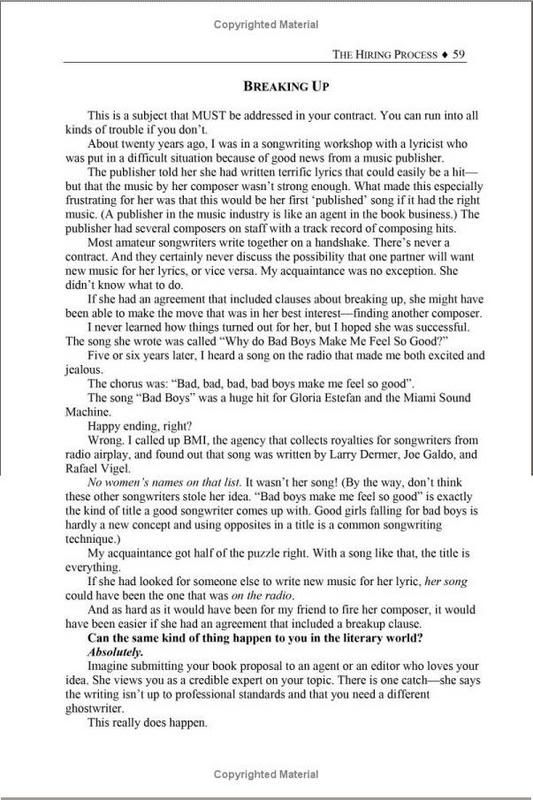
Yeah, there are numerous things wrong with that.
It's not full justified, whereas both textbooks and novels usually are.
I wouldn't have used a serif font for everything, including the header and headings.
The paragraphs are very short for that level of indent (did you just use tab?). Novels usually use a much smaller indent because they have shorter paragraphs. Textbooks, if they indent paragraphs at all, tend towards having larger indents because they have much longer paragraphs.
I don't like the ruled line at the top not extending all the way to the right margin, either. It's lacking in symmetry.
I prefer non-centered titles, too.
It's hard to tell with the font because you're seeing it on a screen, and it's smaller than it would be. |
|
Username
Swimmin' in a Magnum
Joined: 20 Jan 2007
Posts: 3106
(Mon Feb 19, 2007 9:05 pm)
Reply
|
 Re: Typesetting Re: Typesetting |
|
|
| I should have noticed the justification thing. It seems strange that he didn't do that instinctively, since I don't think I've ever seen a book of any sort that didn't use it. |
|
Stupid Fucking Faggot
Stupid 30 fuckbag who likes DBZ
Joined: 20 Jan 2007
Posts: 7037
(Mon Feb 19, 2007 9:17 pm)
Reply

|
 Re: Typesetting Re: Typesetting |
|
|
| Yeah, well, like I said in my WRITEUP, I understand all of this... NOW. |
|
Theldorrin
Joined: 04 Jan 2007
Posts: 19724
(Mon Feb 19, 2007 9:19 pm)
Reply

|
 Re: Typesetting Re: Typesetting |
|
|
| My typography powerlevel is so high. |
|
Stupid Fucking Faggot
Stupid 30 fuckbag who likes DBZ
Joined: 20 Jan 2007
Posts: 7037
(Mon Feb 19, 2007 9:23 pm)
Reply

|
 Re: Typesetting Re: Typesetting |
|
|
I can't say what font I WOULD HAVE chosen, but I figure I would have gone with one of the solid interior standards like Bembo or Baskerville, or whatever.
The fact that I used TNR as the heading font also is an embarrassment, but at least I had enough of an understanding at that point to change it from Comic Sans, which is what my boss had it at originally.
Fucking Comic Sans! |
|
Stupid Fucking Faggot
Stupid 30 fuckbag who likes DBZ
Joined: 20 Jan 2007
Posts: 7037
(Mon Feb 19, 2007 9:25 pm)
Reply

|
 Re: Typesetting Re: Typesetting |
|
|
It's pretty hilarious that I completely accidentally ended up designing, writing, and copyediting books.
Haha, fuckers TRY FOR YEARS to get into that, and it just fell into my lap! And I'm completely incompetent!
Meanwhile, nothing I actually put effort into leads anywhere. |
|
Theldorrin
Joined: 04 Jan 2007
Posts: 19724
(Mon Feb 19, 2007 9:27 pm)
Reply

|
 Re: Typesetting Re: Typesetting |
|
|
HAHAHAHA!
Why would anyone buy a book on writing a book from someone that can't make a professional looking book? |
|
Stupid Fucking Faggot
Stupid 30 fuckbag who likes DBZ
Joined: 20 Jan 2007
Posts: 7037
(Mon Feb 19, 2007 9:29 pm)
Reply

|
 Re: Typesetting Re: Typesetting |
|
|
| I know! Hahahaha! |
|
|


